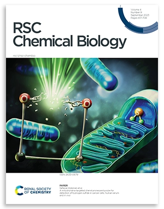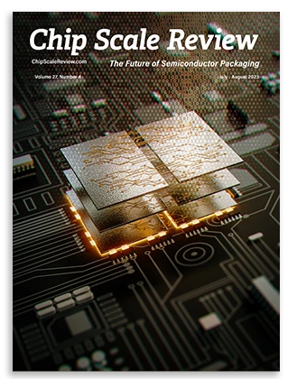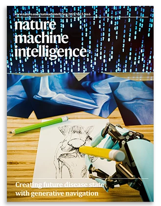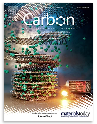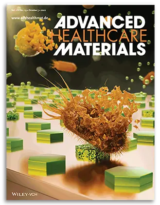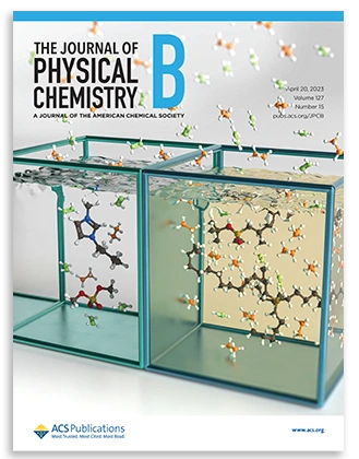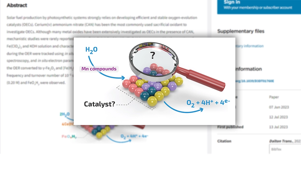
A graphical abstract, often known as a Table of Contents (TOC), visualizes a scientific paper’s primary results or significant points. Usually, a TOC highlights the most essential components of the research. This lets readers immediately comprehend the important findings of the scientific paper without having to study the entire document, allowing them to evaluate whether or not the piece is of interest and what they can learn from it. In this article, we discuss how to make scientific TOC more attractive.
Why It Is Important to Make Scientific TOC Attractive
Making a scientific TOC attractive is not only about aesthetics. It also improves communication and visibility.
Benefits of an attractive scientific TOC:
- Helps readers understand your research within seconds.
- Increases engagement on journal websites and social media.
- Makes complex scientific concepts easier to digest.
- Creates a more professional impression of your publication.
- Supports wider sharing in presentations and academic profiles.
A clean and informative TOC can encourage more readers to click and explore your article.
10 Practical Tips to Make a Scientific TOC More Attractive
Converting research findings into a visual overview is not always straightforward. If you want to develop something that is visually appealing, easy to comprehend, and correct, you must first know some basic design concepts. This post contains 10 design tips to make a scientific TOC:
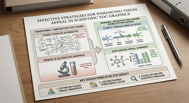

1. Focus on One Main Message
Your TOC should communicate one central idea. Avoid including every experiment, reaction, or result from the paper.
Ask yourself:
What is the single most important takeaway from this research?
Everything in the graphic should support that message.
2. Keep the Layout Simple
Too many elements make a TOC difficult to read.
Use:
- One focal illustration.
- Short labels instead of paragraphs.
- Plenty of white space.
- A clear reading direction (left to right or top to bottom).
Simple layouts are usually more effective than crowded designs.
3. Use High-Quality Scientific Illustrations
Replace blurry screenshots or pixelated figures with clean vector graphics whenever possible.
Good illustrations include:
- Molecular structures.
- Reaction schemes.
- Biological pathways.
- Nanomaterials or devices.
- Simplified experimental setups.
Vector graphics stay sharp in journal publications.
4. Choose Colors Strategically
Color helps guide attention.
Best practices:
- Limit your palette to 3–5 colors.
- Use contrasting colors for important elements.
- Keep background colors light or transparent.
- Maintain consistency throughout the illustration.
Avoid rainbow color schemes unless they represent meaningful scientific data.
5. Make Text Minimal and Readable
A TOC is not a mini abstract.
Keep text:
- Short.
- Large enough to read after resizing.
- Consistent in font style.
- Limited to keywords and labels.
Readers should understand the image without reading long sentences.
6. Highlight the Novelty
Show what makes your work different.
Examples include:
- Improved catalyst performance.
- Higher efficiency.
- Faster detection.
- Sustainable synthesis.
- New molecular mechanism.
Use arrows, icons, or highlighted regions to emphasize the novel contribution.
7. Use Visual Flow
Guide readers through the scientific story.
Common flow elements include:
- Arrows.
- Step-by-step progression.
- Before-and-after comparison.
- Input → Process → Output.
A logical flow makes even complex science easier to follow.
8. Maintain Journal Specifications
Different publishers have different TOC requirements.
Always check:
- Image dimensions.
- Resolution (typically 300 dpi or higher).
- Color mode.
- Allowed text size.
- File format (PNG, TIFF, EPS, or PDF).
Following guidelines prevents unnecessary revisions.
9. Avoid Clutter
Common clutter problems include:
- Too many arrows.
- Excessive labels.
- Tiny chemical structures.
- Multiple unrelated figures.
- Decorative icons with no scientific meaning.
If something does not improve understanding, remove it.
10. Test Your TOC at Thumbnail Size
Most readers first see your TOC as a small thumbnail.
Zoom out and ask:
- Is the main idea still visible?
- Can I identify the important object?
- Is the text readable?
If not, simplify further.
Best Design Principles for Scientific TOC Graphics
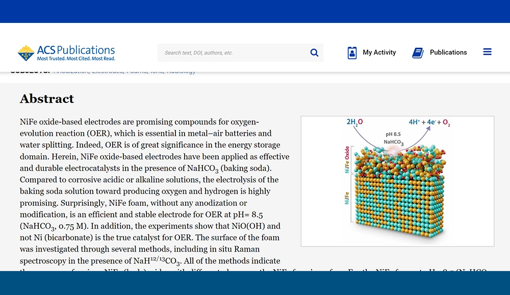
A professional TOC created by Inmywork team | ACS Appl. Energy Mater. 2023, 6, 10, 5536–5547
A professional TOC usually follows several visual design principles:
a) Visual hierarchy
Make the most important element the largest or most colorful object.
b) Balance
Distribute objects evenly to avoid empty or overloaded areas.
c) Alignment
Keep structures, icons, and text aligned for a cleaner appearance.
d) Consistency
Use the same illustration style throughout the graphic.
These principles help make scientific TOC graphics easier to understand and visually appealing.
Checklist Before Submitting Your Scientific TOC
Before uploading your TOC to a journal, review this checklist:
Checklist |
|---|
| Does it communicate one clear scientific message? |
| Is every element readable at thumbnail size? |
| Are colors consistent and meaningful? |
| Is unnecessary text removed? |
| Are arrows and symbols easy to follow? |
| Does the image meet the journal’s size and resolution requirements? |
| Have you exported the final graphic in the correct format? |
A final review can significantly improve the overall quality of your submission.
Frequently Asked Questions
Each journal has its own specifications, but most require a rectangular image with high resolution (typically at least 300 dpi).
No. A scientific TOC should summarize the research visually, not replace the abstract or results section.
Yes, but PowerPoint doesn’t have enough tools to make a challenging and professional TOC.
Making a TOC with AI is acceptable if the publication permits the use of these types of services.
A clear message, simple layout, readable labels, consistent colors, and high-quality scientific illustrations help make scientific TOC graphics more engaging.
Ordering professional TOCS
If graphic design isn’t your thing and you’d rather focus on your research topic, we can assist! The Inmywork team has a lot of experience in scientific TOC illustration. By the way, you can keep in touch with the team for editing several times. The process of delivery time for TOCs depends on the complexity of the project. Your project will be done as soon as possible.
Recent Journal Cover Designs