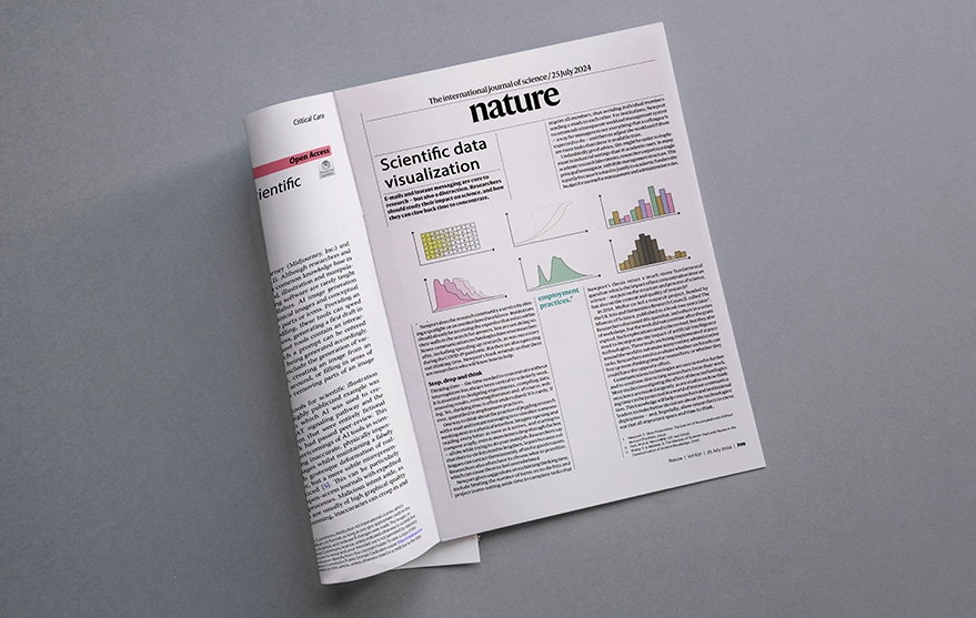
In an age where nearly 2.5 quintillion bytes of data and thousands of papers are produced every day, effective scientific data visualization is essential for making sense of this deluge. By translating data into visual formats—like graphs, charts, and images—we enable better understanding, as people naturally process visual information more readily. Here are key principles to guide your visualization efforts:
8 artistic and effective keys of scientific data visualization
- Simplicity is Key
Strive for clarity in your visuals. Present data in a straightforward manner to ensure it can be grasped at a glance, steering clear of unnecessary distractions.
- Know Your Audience
Tailor your message to suit your audience’s needs. Understand whether they prefer high-level insights or in-depth details, and adjust your presentation accordingly.
- Choose the Right Visualization
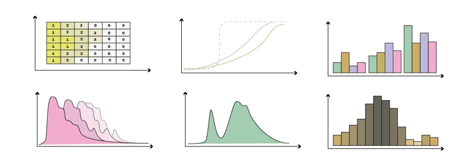
Select the visualization type that aligns with your goals: use bar charts for comparisons, line graphs for trends, and pie charts for illustrating proportions.
- Consistency is Crucial
Stick to a coherent color palette and font style. By assigning specific colors to different elements, you enhance understanding and minimize confusion.
- Maintain Data Integrity
Ensure your axes are appropriately scaled and present the full dataset to avoid misleading interpretations. Transparency is key.
- Highlight Key Insights
Draw attention to important data points using highlights or larger text. Adding brief annotations can effectively communicate critical information.
- Acknowledge Uncertainty
Don’t shy away from representing uncertainty. Use metrics like error bars or confidence intervals, and clarify their meanings. Displaying individual data points is particularly valuable with smaller datasets.
- Utilize Small Multiples
Small multiples are a powerful technique for illustrating variations across datasets. By standardizing design elements, you make comparisons more intuitive.
- Differentiate Data from Models
Be clear about the distinctions between raw data, summaries, and models. Include detailed captions for models to ensure clarity and context.
- Invite External Feedback
Seek out reviews of your visuals to gain fresh perspectives. Encouraging colleagues to focus solely on the visuals allows for constructive feedback, independent of the text.
Conclusion
The art of scientific data visualization merges creativity with analytical reasoning, turning complex data into compelling narratives. By adopting these principles, you can craft visuals that both educate and engage your audience. As data grows in both volume and intricacy, refining these skills will be essential for effective communication across any field.
Process of scientific data visualization
If you want to create a chart without the help of any graphic designer, you can use PowerPoint and the World options. But another suggestion is to order a scientific illustration on the Inmywork website and you can keep in touch with our team for the scientific data visualization.
Recent Journal Cover Designs


Leave a Reply